Welcome to 2023!!!
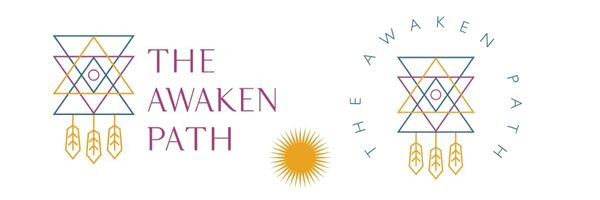
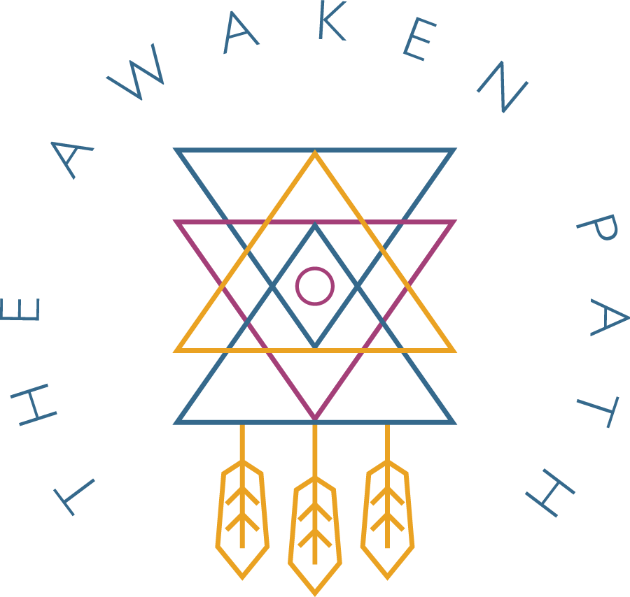
I am so excited to be sharing with you the new branding for The Awaken Path.
Since I followed the Guidance to sell my business in Tuscany and focus solely on my Spiritual Leadership back in 2016, I can assure you that I have “changed skins” more times than I can count… inside. And from what others could see on the outside, I started with a certain name and a logo that since then is on its fourth iteration!
Last year had such a big impact on my life and my transmission as a spiritual leader that towards the last quarter of 2022 I knew my branding was no longer representing who I am and what The Awaken Path and my soul purpose stand for.
I decided that it was time for a revamp and I went into a deep inquiry about this. With the help of my team who I love and who beautifully mirrored back what I was asking about, I birthed our new look and feel.
Brand Manager Teresa Thompson helped me in capturing the essence of what I was feeling and knowing and making it real so that Brand Designer Teresa Villegas could capture it and bring it to life. (If you need their help let me know and I will connect you to them). 😉
The logo you now see has woven within deep symbolism that aligns with my mission, purpose, and transmission. It brings me joy to be introducing it to you today.
I have been a spiritual seeker for more than 40 years and as a result, I embody the wisdom of international shamanism and directly divine channeled guidance.
My unique ability is the transmission of new light codes and frequencies that are now available for humanity to co-create a new world vision and manifest it. The way I do this is by empowering you to activate fully and trust your intuition while expanding your spiritual path and heal what’s holding you back.
That is why even if you aren’t aware of all the symbols woven within my new logo, you would still feel and know that it aligns with you.
One could say the logo can be deemed as a sort of dream catcher, for your dreams! And yet, the individual symbols add another layer of depth and meaning.
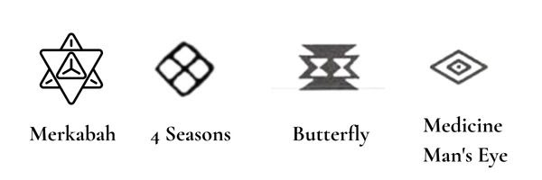
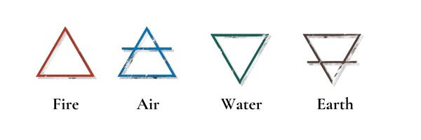
Can you find the symbols below woven within the logo?
* The Merkabah is the container for your light body that makes possible your bilocation or shamanic journeying, call it what you may.
* Medicine Man’s eye for wisdom and guidance
* The four season’s recognizing we are one with the cycles of the Universe.
* The four elements of fire, water, air, and earth reflect our deep connection with Pachamama
* The butterfly holding the frequency of everlasting life as we are allowing our deep transformation through the Earth’s ascension time
* Feathers represent the Eagle and Condor, that reminds us to uplift our energy frequency so that we can continuously find a new way of being
Overall, the logo, the new colors, the new fonts, and alternate symbols fill me with joy and express what I am here for.
You may also be familiar with the maiden-mother-crone symbol (also designed by Teresa Villegas 3 years ago) that represents the cycles of connecting to our inner wisdom, independently of the body we chose to be in for this time on Earth. This icon will continue to be a part of my branding accompanying the materials such as videos and handouts related to my teachings within the framework of the School of Wisdom.
I hope you enjoy the freshness and rebirthing of my brand as I strive to bring forth more ways in which I can support you on your journey to become more of who you are!
Happy New Year!
With love and gratitude in service,
Shakti
‘
Below I’ve included a sample of the new branding!
I’d love to hear your thoughts.
Does it resonate with you?

